Visualizations from Oregon’s THC Potency Data
I Just Felt Like Playing with the Data
I Just Felt Like Playing with the Data
Method: I received 2 large csv files from the state totalling 32 Megabytes. Those files detailed 250,000 THC Potency Results and corresponding rows for Moisture Percentage (I wrote about my findings here). To create these visualizations, I read those csv files into a MySQL database via Python script, and then pulled together some summary statistics to visualize in Tableau.
Animation of THC Result Histogram from 2018–2021
I rounded the values for the result to the whole number and then visualized them, tracking the lab identifiers with a color.
Strain Name by Test Count
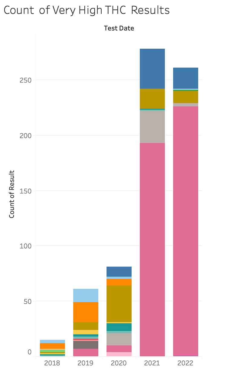
Very High THC Content for Flower by Lab, 2018–2022
I only have a partial year of data for 2022 (Jan — June 2022).
Here I define “Very High Potency” as above 36% but below 60%, which I believe is a keying error for product type. The graph is the count of tests with a result that meets those criteria, and this stacked graph is color-coded by lab.
By Lab:
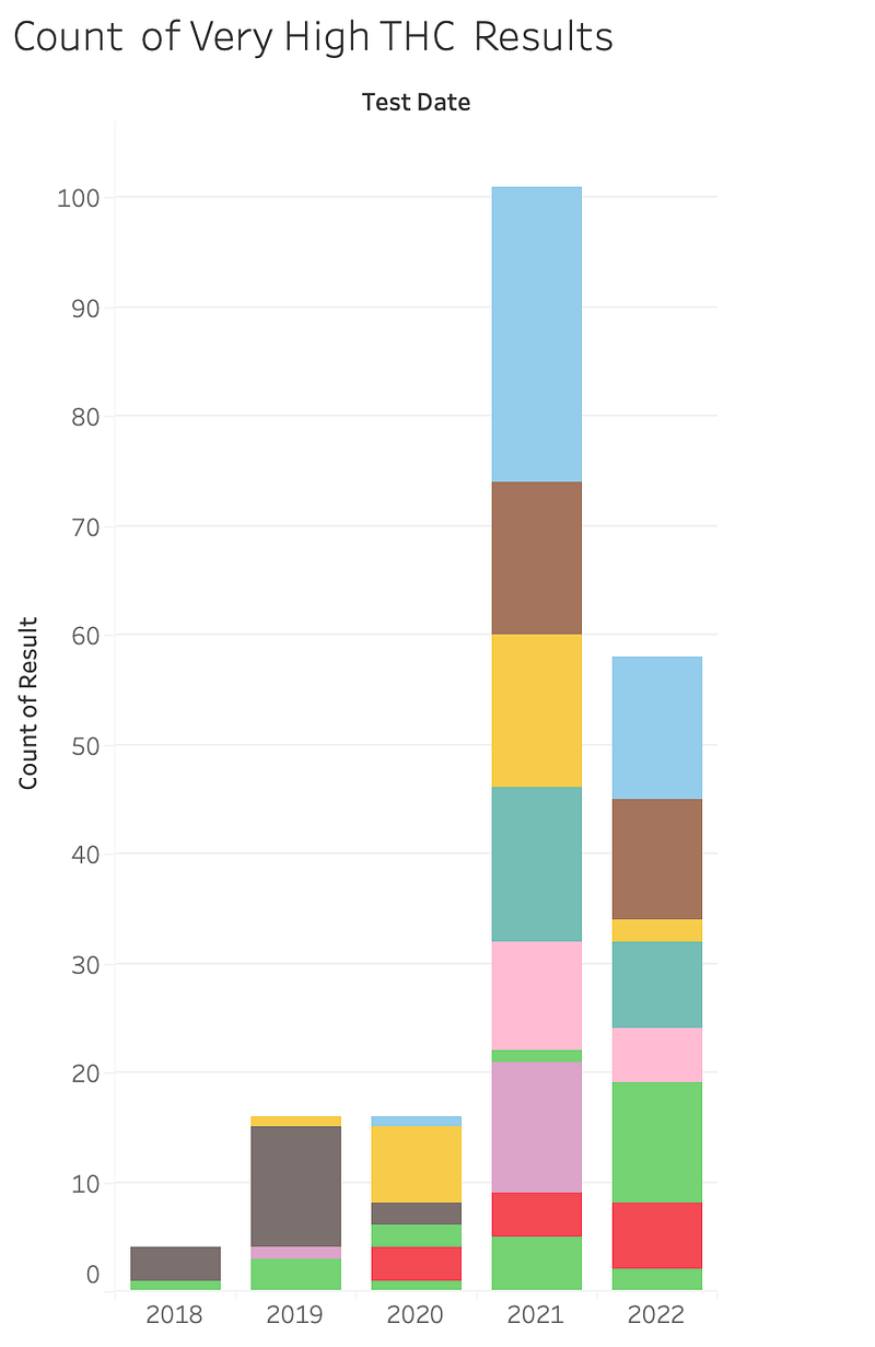
By Producer:

I was curious about seeing just the top 10 Harvesting License Id’s on those high lab results.
If there’s enough interest, I’ll put together a full Tableau Public Dashboard. Until then, I thought these graphs showed some pretty compelling stories.